
Today in 2024, designers have a plethora of fonts at their disposal, ranging from paid options to free ones, providing a wide array of choices for their projects at the best graphic design institute in Delhi. Certainly! Every graphic designer seeks a typeface that captures attention and makes a statement, whether it’s for a creative resume or a fresh logo design.
The importance of professional fonts for graphic designers in 2024. Today, designers have an abundance of fonts available, from paid options to free ones, offering a diverse range of choices for their projects:
- Brand Identity: Professional fonts establish brand identity, ensuring consistency and credibility.
- Visual Appeal: Clear fonts enhance design aesthetics, capturing attention effectively.
- Communication: Professional fonts facilitate clear communication, conveying messages without ambiguity.
- Competitive Advantage: Using professional fonts elevates design sophistication, providing a competitive edge.
- User Experience: Professional fonts improve readability and engagement, enhancing overall user experience.
Overall, these fonts play a vital role in shaping the success of design projects in 2024.
We have compiled a list of professional fonts to give your designs a touch of sophistication. Let’s explore the selection of professional fonts for graphic designers in 2024.
The top professional fonts for graphic designers in 2024 are:
1. Raleway

Source: behance
Raleway, originally introduced as a stylish Google font with a single weight, has since evolved into nine distinct weight families. This expansion increases its adaptability, making it appropriate for a wide range of design purposes.
Notably, Raleway pairs seamlessly with sans-serif fonts, offering designers flexibility in their typographic choices. Easily accessible on fonts.google.com, Raleway presents an accessible option for designers seeking modern and sophisticated typefaces for their projects.

Example: Raleway font used in ADMEC Multimedia homepage
2. Acme Gothic

Source: Mark Simonson Studio
Acme Gothic’s clean lines and simple geometric shapes give it a timeless appeal, perfect for conveying a sense of modernity with a hint of nostalgia. Its adaptability makes it fitting for a diverse array of purposes, ranging from captivating headlines to sophisticated body text.
In branding, signage, or digital interfaces, Acme Gothic distinguishes itself with its unique style and readability, appealing to designers seeking a fusion of modern flair and nostalgic charm.

3. Playfair Display font

Source: font squirrel
This serif font, primarily intended for titles and headlines, adds a touch of elegance to web design. While sans-serif fonts are prevalent in digital contexts, incorporating both serif and sans-serif fonts creates a visually appealing and enduring user experience.
This modern Google font seamlessly complements sans-serif options such as Raleway and Roboto, offering designers a versatile typographic palette. With its adaptability and compatibility, this font facilitates the creation of engaging and sophisticated web content.

Example: Use of Playfair Display font by YourMajesty Company
4. Alkaline
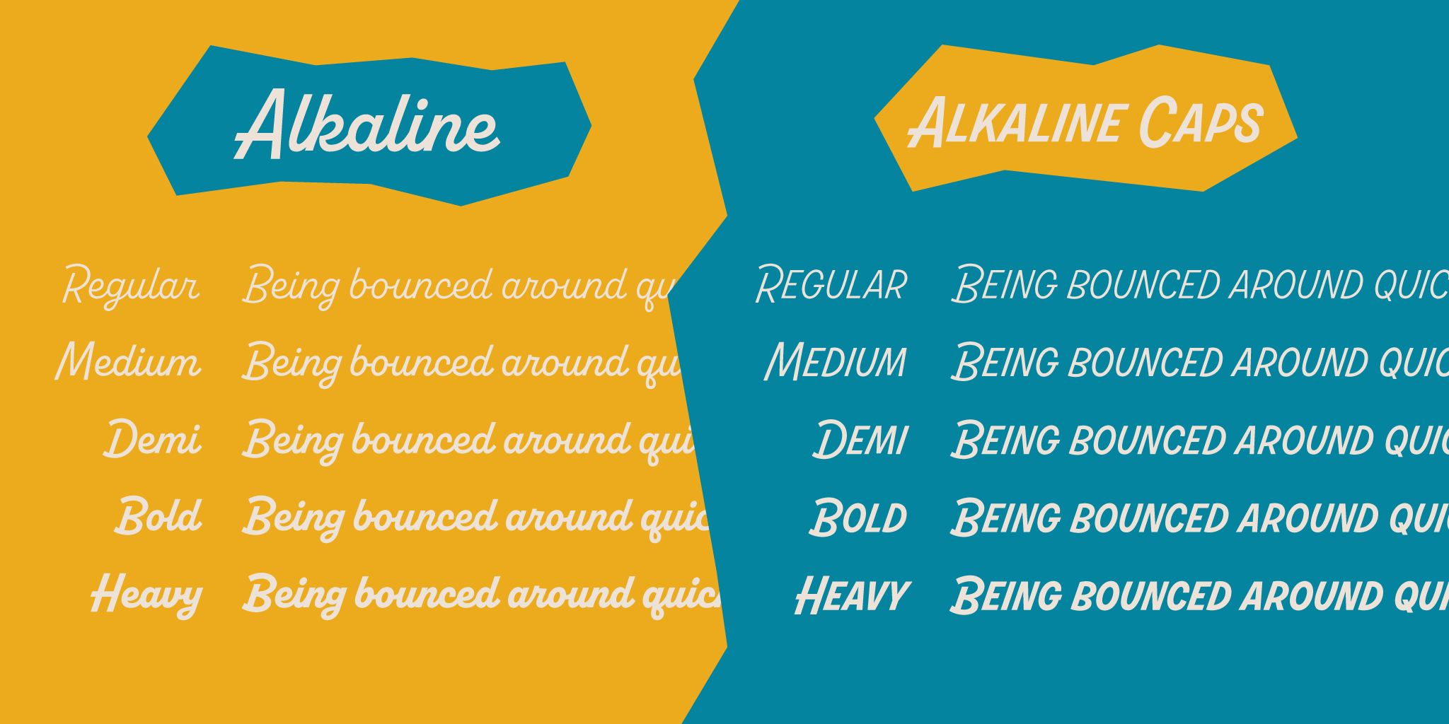
Source: Adobe Fonts
Alkaline is a typeface created by Matt Ellis, known for its clean and minimalist design. Highlighted by elongated, slim letter shapes and delicate curved edges, it presents a sleek and elegant aesthetic.
Alkaline is highly versatile and suitable for various design applications such as branding, editorial design, and digital interfaces. Its elegant simplicity and readability make it a popular choice for designers aiming for a sleek and contemporary aesthetic in their projects.
To know the tips and tricks of how to make design projects by our experts. you can go and explore our graphic design courses.

Source: Fort Foundry
5. Retail

Source: CSS Tricks
The “Retail” typeface from Ohno Type is celebrated for its unique and unmistakable design, making it a favored option among both designers and typographers alike.
Crafted by James Edmondson, this font stands out for its crisp geometric shapes and an interplay between contemporary style and nostalgic undertones. Retain’s aesthetic is inspired by retro retail signage and branding from the mid-20th century, imparting a timeless and familiar feel.
While Ohno Type offers an extensive selection of typefaces on Adobe Fonts, Retail is currently exclusive to its store. However, the investment is undoubtedly worthwhile.
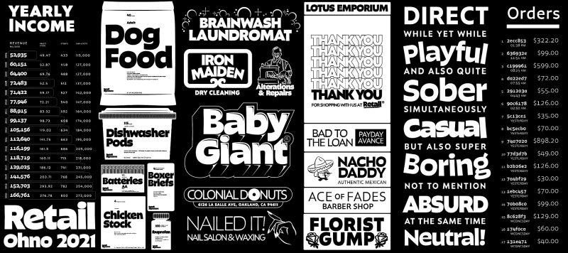
Source: Ohno Type
6. Rustic
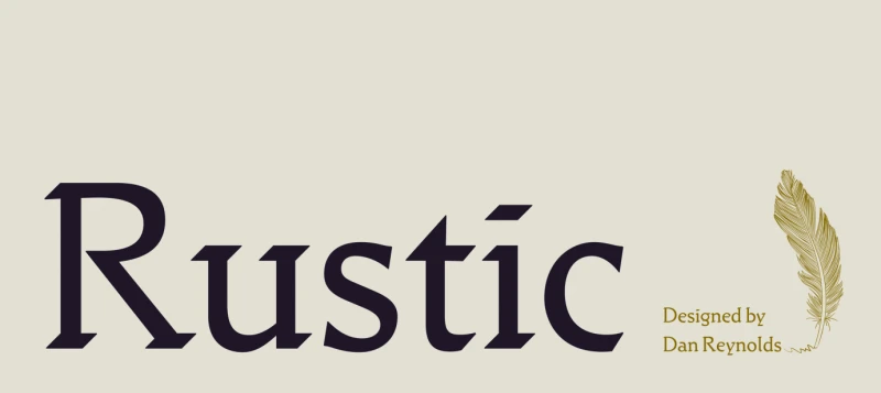
Source: Indian type foundry
The “Rustic” typeface, designed by Sarah Turner, has garnered admiration for its unique and rugged charm, making it a favored choice among designers and typographers. This font, fashioned with meticulous attention, radiates an essence of genuineness and artisanal skill.
While Rustic may not be universally accessible, its unique qualities and distinct character render it a valuable asset in any designer’s arsenal.
7. Rockwell

Source: free fonts family
The geometric slab serif Rockwell draws inspiration from the 1910 font Litho Antique. Originally designed by Morris Fuller Benton in the 1920s, it underwent further refinement and was officially published by Monotype in 1934 under the guidance of Frank Hinman Pierpont. Notably, Rockwell has been featured in various editions of Guinness World Records, highlighting its enduring popularity and widespread recognition.
Geometric slab serif Rockwell was inspired by a 1910 font named Litho Antique. Designer Morris Fuller Benton redesigned Rockwell in the 1920s before it was redesigned and published in 1934 by Monotype, in a project headed by Frank Hinman Pierpont. Guinness World Records used Rockwell in some of their editions.
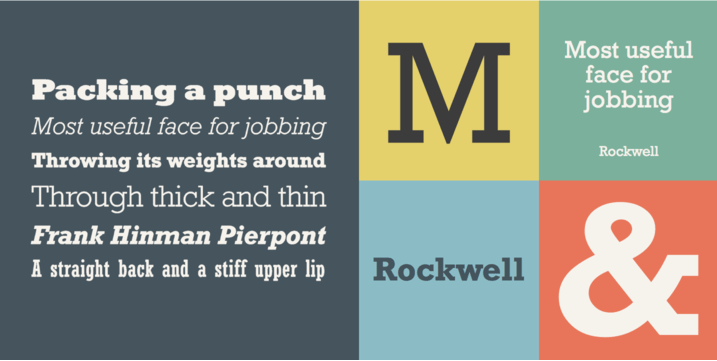
Example: Rockwell font specimen
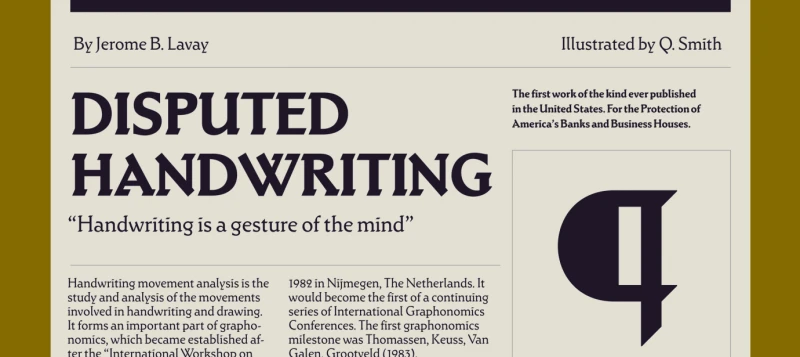
8. Horseman — Elegant Serif Font
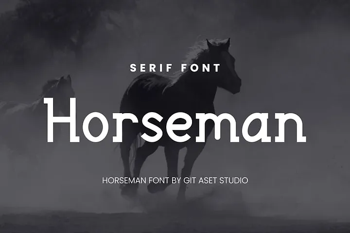
Source: Bootcamp
“Horseman” is an elegant serif font admired for its refined and sophisticated appearance, making it a preferred choice among designers and typographers. Crafted with precision by renowned type designer Emily Jones, this font exudes a sense of timeless elegance and charm.
Taking cues from classical serif typefaces, Horseman achieves an impeccable equilibrium between tradition and innovation. Its elegant letterforms and nuanced details add a dash of refinement to any design undertaking.
While Horseman may not be widely available on all platforms, its exquisite craftsmanship makes it a valuable asset for creating luxurious and stylish typography.

Source: Dafont file
9. Mallory

Source: frere jones type
Mallory, created by Tobias Frere-Jones, is a stunning professional font that originated from an experiment blending typographic traditions, resulting in a fusion of British and American traits. Frere-Jones envisioned Mallory as a versatile tool, capable of seamlessly pairing with other typefaces to organize complex data and refine visual identities.
On his website, Frere-Jones describes Mallory as a comprehensive typeface, boasting over 1250 glyphs in each style. The extensive character set includes small capitals and old-style numerals for text, lining numerals and uppercase punctuation for headings, tabular statistics, and more than a dozen currency symbols for financial information. Mallory’s careful design and diverse features make it an essential resource for designers seeking both practicality and visual appeal.

Example: Use of Mallory Font in Invoice
10. Monorama
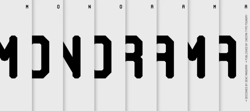
Source: Indian Type Foundry
“Monorama” is a captivating typeface revered for its distinctive and contemporary design, earning it a special place among designers and typographers. Crafted by the skilled font designer David Lee, this typeface emanates a feeling of contemporary elegance.
Inspired by minimalist aesthetics and clean lines, Monorama embodies a sleek and refined appearance. While Monorama may not be widely distributed across all platforms, its unique charm and versatility make it a coveted addition to any designer’s repertoire.

As a designer, it’s important to keep up with industry trends and famous typefaces in 2024. Typography plays a major role in great user experience, and to make this happen every individual needs to be updated with the latest modern and beautiful fonts. Hope this list will be of great help and you will be using it in your projects depending on the requirements.
Every designer has their own choice, and we would love to hear what you think about this list of fonts!
We hope this curated list of professional fonts serves as a valuable resource for your future projects, inspiring creativity and innovation in your work. Explore the realm of Professional Fonts For Graphic Designers in 2024 and unleash your design potential by exploring the best graphic design institute in Delhi.
If you have a favorite font that you want to recommend, feel free to post it below in the comments section.
View the Full Presentation on Slideshare: Tips and Tricks on how to use Typography
Tips and Tricks on how to use Typography from ADMEC Multimedia Institute
[…] can preview the font they have selected by hovering their mouse over the several different fonts in the list. The designers can now also preview the font by moving over their mouse over the list. […]