Most of the time people often think that design is all about creativity. If you’re an entrepreneur or designer who has just started their career, you might combine any five typefaces and colors that catches your eye and might think your design is creative. But soon after you probably find yourself with a design that is scrambled, incomplete, or well, just plain unpleasant. Graphic design, like any discipline, follows to strict rules that work beneath the surface to make the work stable and balanced. If the work is missing that balance, it will be weak and ineffective. These rules are known as Principles of design. They are also popularly known as “Principles of Visual Art” which are the applied guidelines used to organize the structural elements of design. These rules should be followed by every designer to create an effective composition that cleanly delivers a message to their audience.
Principles of Design when successfully combined with the elements of design allow the designers to create aesthetic work of art and should be keep in mind when working with visuals and creating graphics. In this blog, we will discuss about 7 basic principles of design that will make your next project stand out. These 7 major principles of designs are:-
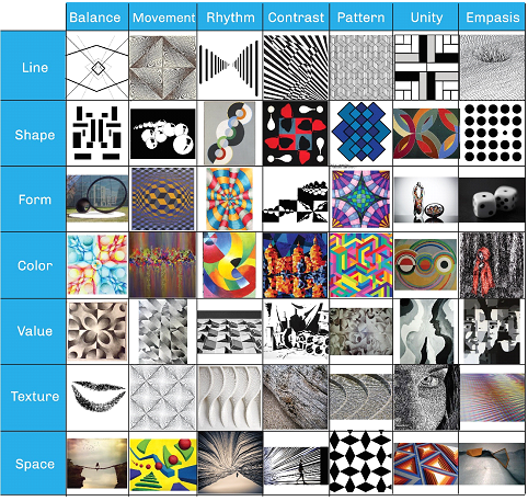
Now let us discuss all the principles of design in details:
1. Balance

Always remember that every element you place in a design has a weight. The weight can come from color, size, or texture. The way you won’t put all your furniture in one corner of a room, you can’t crowd all your heavy elements in one area of your composition. Without balance, your audience will feel as if their eye is sliding off the page. Typically balance provides structure and stability to a design. Balance can be symmetrical (evenly balanced) or asymmetrical (un-evenly balanced).
- Symmetrical Balance is often referred to as formal balance in visual images. Balance is formal when both sides are equal or in proportion in terms of arrangement.

In the above poster of “Sherlock Homes” has been made with a combination of visual elements keeping in mind the symmetry between the left and right-hand side. Design elements on the left side of the balance with right-hand side elements such as the right side of the mirror.
- Asymmetrical Balance is often referred to as informal balance in visual images. Balance is considered as informal when sides are not exactly symmetrical; however, the resultant image is still balanced. Essentially asymmetrical balance is more dynamic than formal balance.

Above poster is a perfect example of “Asymmetrical Balance” because visual weight of design elements is not evenly distributed in the central axis of the page. Elements of a large black hand balanced by Flawless black text but its small size.
2. Movement

Movement is controlling the elements in a composition so that the eye is led to move from one to the next and the information is properly communicated to your viewers. It is used to guide the viewer through the piece. Lines, shapes, color, depth and hierarchy can all be used to guide the viewer from one point to the next – at a glance. Visual movement is more commonly known in the graphic design world as ‘flow’.

Awesome use of visual hierarchy in design 977 website and color to guide the eye. The logo, the caption and the navigation create a triangle. The large colored blocks that frame each element, lead the eye in a slight zig-zag pattern downward from the upper left corner down to the navigation.
3. Rhythm
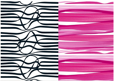
Rhythm is created when one or more elements of design are used repeatedly to create a feeling of organized movement or we can say it requires the repetition of a variety of design elements in a specific order. Rhythm can be achieved through linear elements, alternating elements, gradation, repetition, or intricate details.
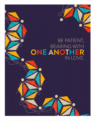
In the above image, rhythm has been created beautifully by making use of various repetitive design elements which is giving a feel of organized movements.
4. Contrast

Contrast is an important principle of design because it lets you draw out the most important elements of a design and add importance. Contrast happens when two design elements are in opposition to each other, like black and white, thick and thin, modern and traditional, etc. Contrast is what helps guide the viewer’s eyes to the most important parts of your design and helps organize the information in an easy manner.
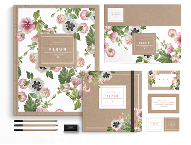
The above example showcases how texture can be used to create contrast. The boxes, lines and typeface are very clean and linear which contrasts to the organic nature of the illustrations.
5. Pattern
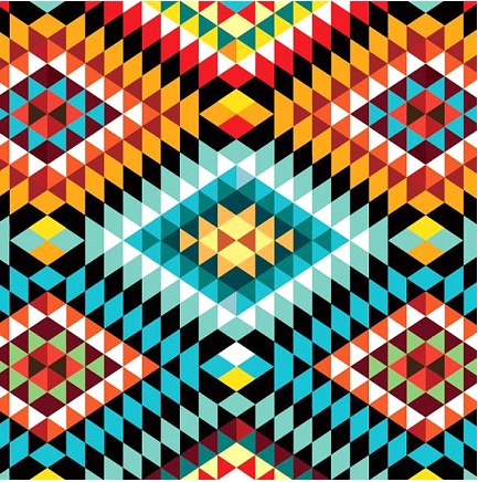
Pattern as a principle of design may be defined as regular arrangement of repeated same elements i.e. line, shape, colors over and over again. Pattern usually increases the visual excitement by supplementing surface interest. The use of such patterns can enhance the user experience, as well as the design and look of the final product, but must be used wisely so as to avoid a complicated layout or unattractive design.

One can use beehive pattern to design stationary for any business as shown in the example above. It is done by Federica Belafonte for Bee Visual that channels the iconic hexagonal beehive honeycomb shape and creates a beautiful simple pattern.
6. Unity
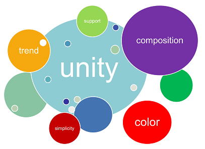
Unity as a principle of design may be defined as the appropriate arrangement of elements of a visual to give the viewers a feeling that all the parts of the design are in harmony as a whole composition. By harmony we mean all sections of the pattern, words & images make other section feel complete. Unity as a designing principle gives a sense of completeness to a visual image.
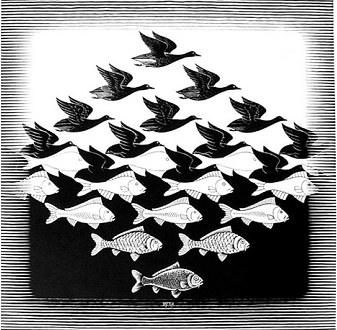
Elements can be conceptually unified by being about the same subject. The above image uses birds and fishes to balance between unity and variety so as to have a well-ordered design that is also visually interesting.
7. Emphasis
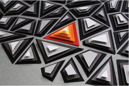
Emphasis literally means to give importance. It is a principle of design which refers to giving special importance to one or certain part of the design. The goal is to grab the attention of the audience in one go. Emphasis in an image can be achieved through contrast, placement, size, color, repetition, focal point / dominance etc.

As shown in the above example, emphasis is given on the flower to make it stand apart from the background. We can also say that to make a focus on a particular element in a design, a dark color is used to highlight the element shape in a light composition.
Summary
Principles of Design described here are of utmost importance in any design or work of art. In fact they form the essential designing principles. These principles of design along with the designing elements serve as basic knowledge and analytical framework for the designers. Whether you’re consciously aware of them or not, each of the above components will be present in your design. These principles are the foundation of successful artwork; some are easier to grasp than others but with time and practice you can learn to recognize and use them to create some really great art. The best way to learn about them is by joining graphic design courses at the best Graphic Design Institute in Delhi which covers this as a part of their course curriculum.
Examples shown in this blog are some of our favorite designs. Have you ever come across any great examples of the principles of design? If yes, then share with us about it in the comments!


[…] various images across a piece creating a sense harmony despite their differences. This type of design I personally like a lot because it keeps the same general theme but each image is unique. […]
[…] hands on software but also on its basics fundamentals and elements. Diploma programs cover both design principles and software training. They offers a comprehensive curriculum and are planned to make you an elite […]
[…] Important design principles […]
[…] for a designer’s job position, it is obvious that you are aware of basic design elements and principles. You would probably know the importance of typography in the […]
[…] option to create a visually stunning design. This is considered as one of the most overlooked principles of design but it actually gives the eye a place to rest in the design, increasing the appeal of the design […]
[…] stand out over everything else? Great design can take a masterfully crafted pitch or principle and also drive […]
[…] you pursue a diploma program; it not only comes with leading software applications but also cover design fundamentals and fine arts training. These skills are what make you an elite designer and a suited one for the […]
[…] Creativity is such a field that will always allow you to transcend the physical boundaries. You can visualize things and turn them into reality using software available in the market. It gives you the freedom to express yourself in a distinguished way. You can create your own mark while still going with the essential design rules and principles. […]